Cards
These modular elements can be readily used and customized in every layout across pages.
For detail documentation, View Card on Bootstrap
Basic Example
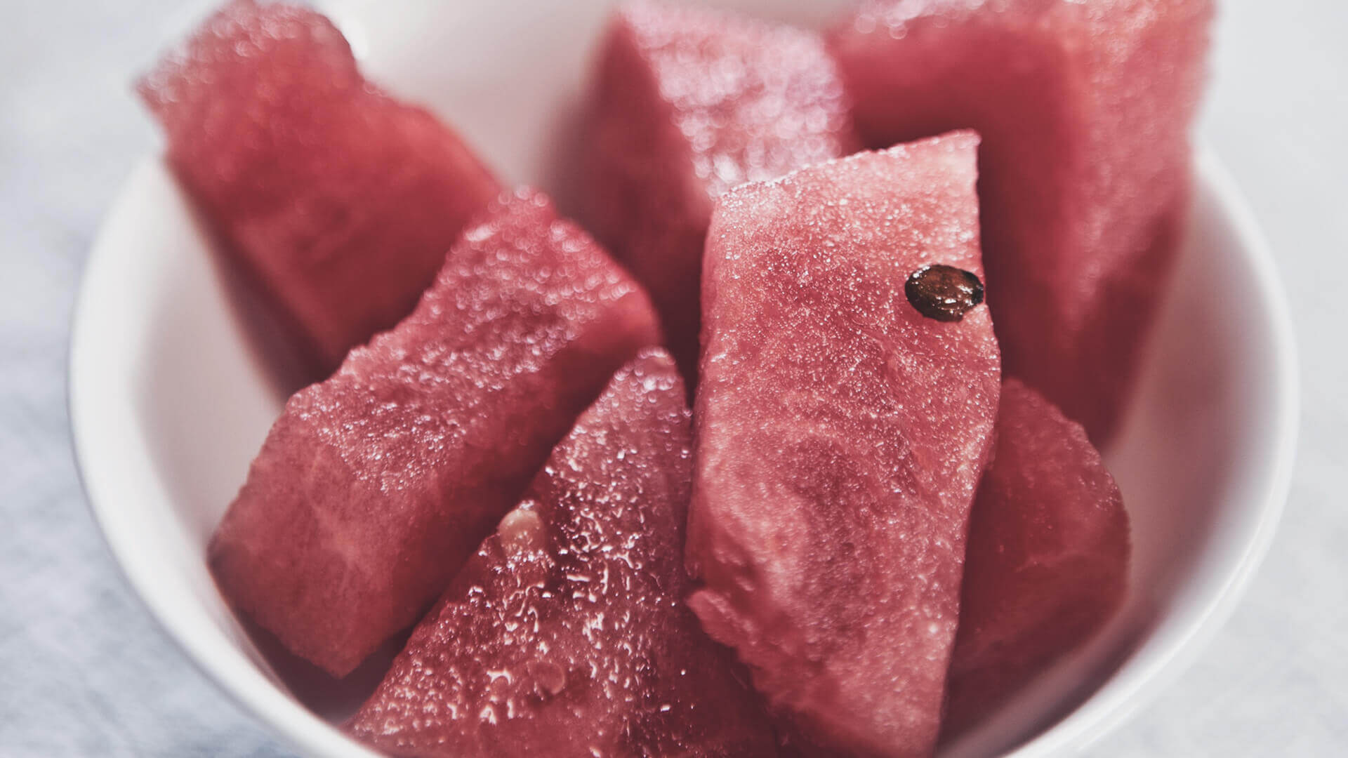
Card title
Some quick example text to build on the card title and make up the bulk of the card's content.
Go somewhere<div class="card" style="width: 20rem;">
<div class="card-img-top"><img class="img-fluid" src="../assets/img/gallery/g1.jpg" alt="Card image cap"></div>
<div class="card-body">
<h5 class="card-title">Card title</h5>
<p class="card-text">Some quick example text to build on the card title and make up the bulk of the card's content.</p><a class="btn btn-primary btn-sm" href="#!">Go somewhere</a>
</div>
</div>Titles, text and links
Card title
Card subtitle
Some quick example text to build on the card title and make up the bulk of the card's content.
Card linkAnother link<div class="card" style="width: 18rem;">
<div class="card-body">
<h5 class="card-title">Card title</h5>
<h6 class="card-subtitle mb-2 text-muted">Card subtitle</h6>
<p class="card-text">Some quick example text to build on the card title and make up the bulk of the card's content.</p><a class="card-link" href="#">Card link</a><a class="card-link" href="#">Another link</a>
</div>
</div>List Groups
- Cras justo odio
- Dapibus ac facilisis in
- Vestibulum at eros
<div class="card" style="width: 18rem">
  <ul class="list-group list-group-flush">
    <li class="list-group-item">Cras justo odio</li>
    <li class="list-group-item">Dapibus ac facilisis in</li>
    <li class="list-group-item">Vestibulum at eros</li>
  </ul>
</div>
Card with image

Card title
Some quick example text to build on the card title and make up the bulk of the card's content.
- Cras justo odio
- Dapibus ac facilisis in
- Vestibulum at eros
<div class="card" style="width: 20rem;">
  <div class="card-img-top"><img class="img-fluid" src="../assets/img/gallery/g3.jpg" alt="Card image cap"></div>
  <div class="card-body">
    <h5 class="card-title">Card title</h5>
    <p class="card-text">Some quick example text to build on the card title and make up the bulk of the card's content.</p>
  </div>
  <ul class="list-group list-group-flush">
    <li class="list-group-item">Cras justo odio</li>
    <li class="list-group-item">Dapibus ac facilisis in</li>
    <li class="list-group-item">Vestibulum at eros</li>
  </ul>
  <div class="card-body"><a class="card-link" href="#!">Card link</a><a class="card-link" href="#!">Another link</a></div>
</div>
Header and Fooder
Special title treatment
With supporting text below as a natural lead-in to additional content.
Go somewhere<div class="card">
<div class="card-header">Featured</div>
<div class="card-body">
<h5 class="card-title">Special title treatment</h5>
<p class="card-text">With supporting text below as a natural lead-in to additional content.</p><a class="btn btn-primary" href="#">Go somewhere</a>
</div>
</div>Card Overlay
<div class="card text-white" style="max-width: 30rem;">
  <div class="card-img overflow-hidden"><img class="img-fluid" src="../assets/img/gallery/g9.jpg" alt="Card image"></div>
  <div class="card-img-overlay d-flex align-items-end">
    <div>
      <h5 class="card-title text-white">Card title</h5>
      <p class="card-text">Some quick example text to build on the card title and make up the bulk of the card's content.</p>
    </div>
  </div>
</div>
Card Groups
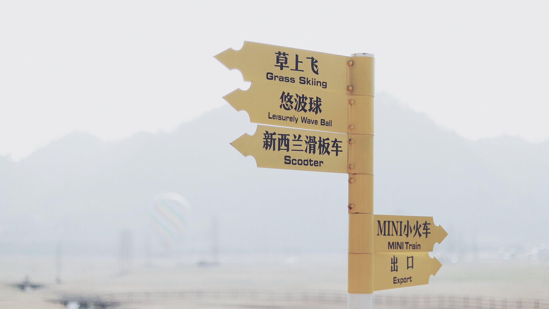
First card title
This is a wider card with supporting text below as a natural lead-in to additional content. This content is a little bit longer.
Last updated 45 mins ago

Second card title
This card has supporting text below as a natural lead-in to additional content.
Last updated an hour ago

Yet another card title
This is a wider card with supporting text below as a natural lead-in to additional content. This card has even longer content than the first to show that equal height action.
Last updated yesterday
<div class="card-group">
  <div class="card">
    <div class="card-img-top"><img class="img-fluid" src="../assets/img/gallery/g4.jpg" alt="Card image cap"></div>
    <div class="card-body">
      <h5 class="card-title">First card title</h5>
      <p class="card-text">This is a wider card with supporting text below as a natural lead-in to additional content. This content is a little bit longer.</p>
      <p class="card-text"><small class="text-muted">Last updated 45 mins ago</small></p>
    </div>
  </div>
  <div class="card">
    <div class="card-img-top"><img class="img-fluid" src="../assets/img/gallery/g5.jpg" alt="Card image cap"></div>
    <div class="card-body">
      <h5 class="card-title">Second card title</h5>
      <p class="card-text">This card has supporting text below as a natural lead-in to additional content.</p>
      <p class="card-text"><small class="text-muted">Last updated an hour ago</small></p>
    </div>
  </div>
  <div class="card">
    <div class="card-img-top"><img class="img-fluid" src="../assets/img/gallery/g6.jpg" alt="Card image cap"></div>
    <div class="card-body">
      <h5 class="card-title">Yet another card title</h5>
      <p class="card-text">This is a wider card with supporting text below as a natural lead-in to additional content. This card has even longer content than the first to show that equal height action.</p>
      <p class="card-text"><small class="text-muted">Last updated yesterday</small></p>
    </div>
  </div>
</div>
Card Decks

Awesome card title
This is a longer card with supporting text below as a natural lead-in to additional content. This content is a little bit longer.
Last updated 22 mins ago

Beautiful card title
This card has supporting text below as a natural lead-in to additional content.
Last updated 3 hours ago

Gorgeous card title
This is a wider card with supporting text below as a natural lead-in to additional content. This card has even longer content than the first to show that equal height action.
Last updated on Monday
<div class="card-deck">
  <div class="card">
    <div class="card-img-top"><img class="img-fluid" src="../assets/img/gallery/g6.jpg" alt="Card image cap"></div>
    <div class="card-body">
      <h5 class="card-title">Awesome card title</h5>
      <p class="card-text">This is a longer card with supporting text below as a natural lead-in to additional content. This content is a little bit longer.</p>
      <p class="card-text"><small class="text-muted">Last updated 22 mins ago</small></p>
    </div>
  </div>
  <div class="card">
    <div class="card-img-top"><img class="img-fluid" src="../assets/img/gallery/g7.jpg" alt="Card image cap"></div>
    <div class="card-body">
      <h5 class="card-title">Beautiful card title</h5>
      <p class="card-text">This card has supporting text below as a natural lead-in to additional content.</p>
      <p class="card-text"><small class="text-muted">Last updated 3 hours ago</small></p>
    </div>
  </div>
  <div class="card">
    <div class="card-img-top"><img class="img-fluid" src="../assets/img/gallery/g8.jpg" alt="Card image cap"></div>
    <div class="card-body">
      <h5 class="card-title">Gorgeous card title</h5>
      <p class="card-text">This is a wider card with supporting text below as a natural lead-in to additional content. This card has even longer content than the first to show that equal height action.</p>
      <p class="card-text"><small class="text-muted">Last updated on Monday</small></p>
    </div>
  </div>
</div>
Card Columns

Card title that wraps to a new line like this
This is a longer card with supporting text below as a natural lead-in to additional content. This content is a little bit longer.
Lorem ipsum dolor sit amet, consectetur adipiscing elit. Integer posuere erat a ante.

Card title
This card has supporting text below as a natural lead-in to additional content.
Last updated 3 mins ago
Lorem ipsum dolor sit amet, consectetur adipiscing elit. Integer posuere erat.
Card title
This card has a regular title and short paragraphy of text below it.
Last updated 3 mins ago
Card title
This is another card with title and supporting text below. This card has some additional content to make it slightly taller overall.
Last updated 3 mins ago

Lorem ipsum dolor sit amet, consectetur adipiscing elit. Integer posuere erat a ante.
<div class="card-columns">
  <div class="card"><img class="card-img-top" src="../assets/img/gallery/g4.jpg" alt="Card image cap">
    <div class="card-body">
      <h5 class="card-title">Card title that wraps to a new line like this</h5>
      <p class="card-text">This is a longer card with supporting text below as a natural lead-in to additional content. This content is a little bit longer.</p>
    </div>
  </div>
  <div class="card p-3">
    <blockquote class="blockquote mb-0 card-body">
      <p>Lorem ipsum dolor sit amet, consectetur adipiscing elit. Integer posuere erat a ante.</p>
      <footer class="blockquote-footer"><small class="text-muted">Someone famous in
          <cite title="Source Title">Source Title</cite></small></footer>
    </blockquote>
  </div>
  <div class="card"><img class="card-img-top" src="../assets/img/gallery/g5.jpg" alt="Card image cap">
    <div class="card-body">
      <h5 class="card-title">Card title</h5>
      <p class="card-text">This card has supporting text below as a natural lead-in to additional content.</p>
      <p class="card-text"><small class="text-muted">Last updated 3 mins ago</small></p>
    </div>
  </div>
  <div class="card bg-primary text-white text-center p-3">
    <blockquote class="blockquote mb-0">
      <p>Lorem ipsum dolor sit amet, consectetur adipiscing elit. Integer posuere erat.</p>
      <footer class="blockquote-footer"><small class="text-white-50">Someone famous in
          <cite title="Source Title">Source Title</cite></small></footer>
    </blockquote>
  </div>
  <div class="card text-center">
    <div class="card-body">
      <h5 class="card-title">Card title</h5>
      <p class="card-text">This card has a regular title and short paragraphy of text below it.</p>
      <p class="card-text"><small class="text-muted">Last updated 3 mins ago</small></p>
    </div>
  </div>
  <div class="card">
    <div class="card-body">
      <h5 class="card-title">Card title</h5>
      <p class="card-text">This is another card with title and supporting text below. This card has some additional content to make it slightly taller overall.</p>
      <p class="card-text"><small class="text-muted">Last updated 3 mins ago</small></p>
    </div>
  </div>
  <div class="card"><img class="card-img" src="../assets/img/gallery/g9.jpg" alt="Card image"></div>
  <div class="card p-3 text-right">
    <blockquote class="blockquote mb-0">
      <p>Lorem ipsum dolor sit amet, consectetur adipiscing elit. Integer posuere erat a ante.</p>
      <footer class="blockquote-footer"><small class="text-muted">Someone famous in
          <cite title="Source Title">Source Title</cite></small></footer>
    </blockquote>
  </div>
</div>